Top 3 of the worst plane crashes.
United States, Russia, and others.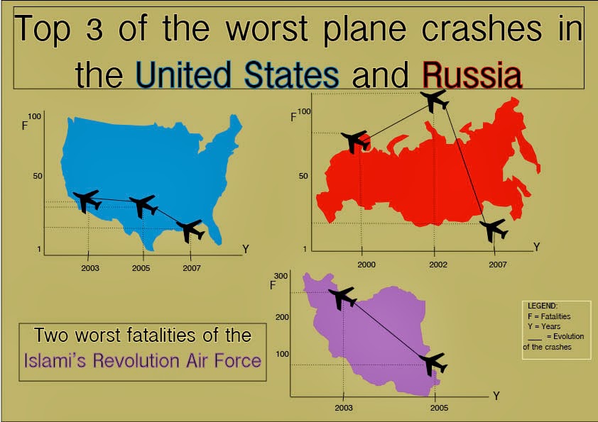 |
| Infographic
This infographic represents the three worst fatalities on EEUU and Russia. In comparison, Russia had more fatalities than United States by number of people deaths. Two of them had more than 50 deaths meanwhile EEUU had less than 50 fatalities in each crash.
As a curiosity there's under that a graphic with the two worst fatalities of the Islami's Revolution Air Force with a high number of deaths in two crashes.
I decided to select the color of the background just to be neutral in comparison with the saturated colors I used for the maps. Every map is related in color with the letters of the place we are talking about, all in red, blue and purple. The background color seems some kind of military color so it helps to my graphic to be understood.
As we are talking about airplanes crashes, the icons that remarks the fatalities are military planes.
H.
|
Hi Helena! your graphic is very interesting. I like the way that you explain the crashes in EEUU and Russia. The colors you've used to help understand the graphic, so good job Helena.
ReplyDeleteHi Helena! I think you did a great job with this graphic and you have chosen the correct colours. Also I like the idea that you have added the a graphic about the Islami's Revolution Air Force.
ReplyDeleteHi Helena! I see you only use few ornaments and your graphics information is very clear. I don't like so much dense information, I prefer single things because it makes easier to understand what you want to transmit. The objects that you used are very familiar and this also helps to understand everything quickly. I congratulate you, good job!
ReplyDeleteHi Helena! I really like your graphic, I think it would be very suitable for being published on a newspaper, together with an article explaining with more detail the most recent or important militar airplane crashes. The idea of leaving a more neutral background oppositely to the countries' bright colors is very good! Maybe you should have differenciated the title with a different type of font to make it pop out more, because here the attention is automatically focused on the bright colors of the different countries.
ReplyDeleteKeep on doing with your blog! Good job!